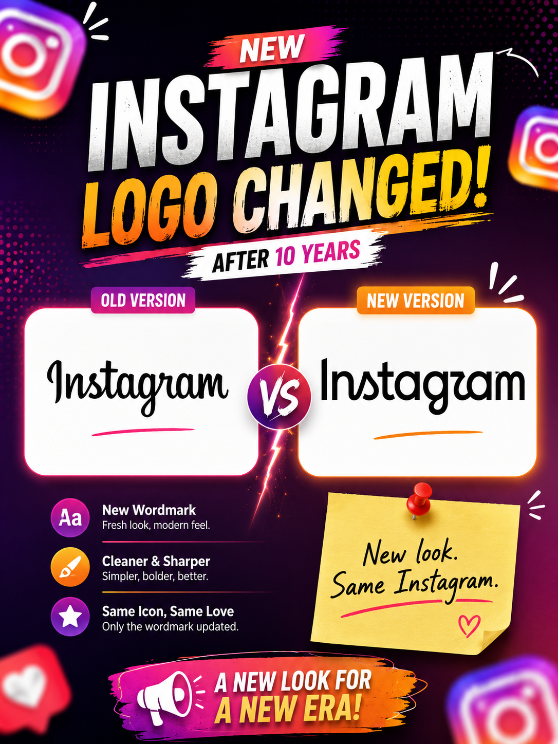
Instagram has changed its logo — and the internet has already noticed.
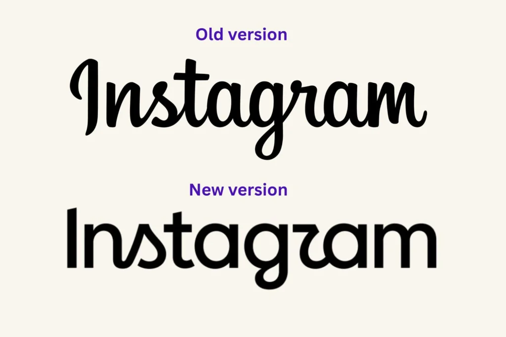
On August 13, 2026, Instagram introduced a redesigned wordmark, marking the first major update to its written logo in nearly a decade. The familiar Instagram lettering that users have seen since 2016 has been replaced with a newer design that combines elements of cursive handwriting with a more modern, structured appearance.
But there is an important detail: Instagram has not changed the colourful camera icon that users see on their phones. The current update focuses on the text-based Instagram wordmark used inside the app, on marketing materials, and across the brand.
Why Did Instagram Change Its Logo?
Instagram’s previous wordmark had been around since 2016. According to Instagram head Adam Mosseri, the older design had started to feel dated after nearly ten years.
The company wanted something that felt cleaner, sharper, and more modern, while still maintaining a connection with Instagram’s original visual identity.
Instead of completely abandoning its recognisable handwriting style, Instagram’s design team created a hybrid approach.
The new lettering retains some of the curves associated with Instagram’s original identity while making the characters more compact and contemporary.
In other words, Instagram didn’t completely reinvent its logo.
It redesigned its handwriting.
What Actually Changed?
The biggest change is the typography.
The previous Instagram wordmark had a smoother and more familiar cursive appearance. The new version introduces stronger shapes and more distinctive curves, particularly in letters such as S, r, and g.
Instagram has also expanded its broader typography system with three typefaces:
- Instagram Sans
- Instagram Pen
- Instagram Mono
The idea is to give Instagram a more flexible visual identity that can work across different types of content and communication.
The Logo That Still Hasn’t Changed
Despite headlines saying “Instagram changed its logo”, there is an important distinction.
The Instagram app icon remains the same.
That means the familiar square camera symbol with its pink, purple, orange, and yellow gradient remains recognizable on smartphone home screens.
For most users, this is actually the most important part of Instagram’s visual identity because people recognize the app primarily through its icon rather than by reading the word “Instagram.”
So this isn’t a complete rebrand.
It is more accurately described as a wordmark refresh.
Why Are People Making Fun of the New Logo?
The internet’s reaction has been mixed.
Some designers and users appreciate the more modern appearance, while others believe the new lettering is less readable than the previous version.
One particular criticism has gone viral: some users say the new “r” looks more like a “z”, making “Instagram” appear to read something like “Instagzam.”
Social media reactions have therefore turned the redesign into a meme almost immediately.
This highlights an important problem with logo design:
A logo can be visually interesting, but if people cannot immediately recognise what it says, the redesign can work against the brand.
Why This Matters for Instagram
At first glance, changing a font might seem like a small decision.
But for a company as recognisable as Instagram, even a small change can have a significant impact.
Instagram’s wordmark has appeared across:
- The Instagram app
- Websites
- Advertisements
- Creator campaigns
- Events
- Merchandise
- Brand partnerships
- Marketing materials
Changing it means updating a visual identity that billions of people recognise.
That’s why companies normally approach these changes very carefully.
Instagram Is Growing Beyond Its Original Identity
There is also a bigger story behind the redesign.
Instagram in 2026 is very different from the Instagram of 2016.
Ten years ago, Instagram was primarily known for photographs and Stories.
Today, the platform is heavily focused on:
Reels + creators + messaging + AI + commerce + communities.
The new wordmark can therefore be seen as part of Instagram’s attempt to modernise its identity for a platform that has evolved significantly over the last decade.
The company is no longer just a photo-sharing application.
It has become a massive creator and entertainment platform.
Is the New Logo Better?
That’s subjective.
From a branding perspective, the redesign has some advantages. It attempts to preserve Instagram’s recognizable handwritten character while giving it a more contemporary appearance.
But readability is where the debate begins.
A successful logo should ideally be recognisable quickly and work across different sizes and devices. If users immediately start debating whether a letter is an “r” or “z,” that’s something the design team will inevitably have to consider.
The mixed reaction shows just how difficult it is to redesign an iconic brand.
Final Thoughts
Instagram’s 2026 logo update may look like a small typography change, but it represents something bigger: Instagram is entering a new stage of its visual identity.
After almost ten years, the company decided that its familiar wordmark needed a refresh.
The colorful Instagram camera icon remains unchanged, but the written logo has received a new personality — one that Instagram describes as cleaner and more modern.
Whether users eventually love the new design or continue calling it “Instagzam” remains to be seen.
But one thing is certain:
Instagram changed its logo after a decade, and the internet definitely has an opinion about it.